Logotype / Graphic Identity / Pattern design / Web Design
Consulting Firm Branding | Procedural
Client
Procedural is a process optimization consulting firm based in Alabama that works remotely in the United States. As a new brand they needed to seek credibility and expertise to their customers.
Concept
The main concept of the brand identity revolves around the idea of structure and organization. Procedural as a consultancy optimizes processes and takes care of chaos in organizations and businesses. It was essential to portray the idea of order. The look also needed to be clean, fresh, solid and a bit high-tech.
Logotype
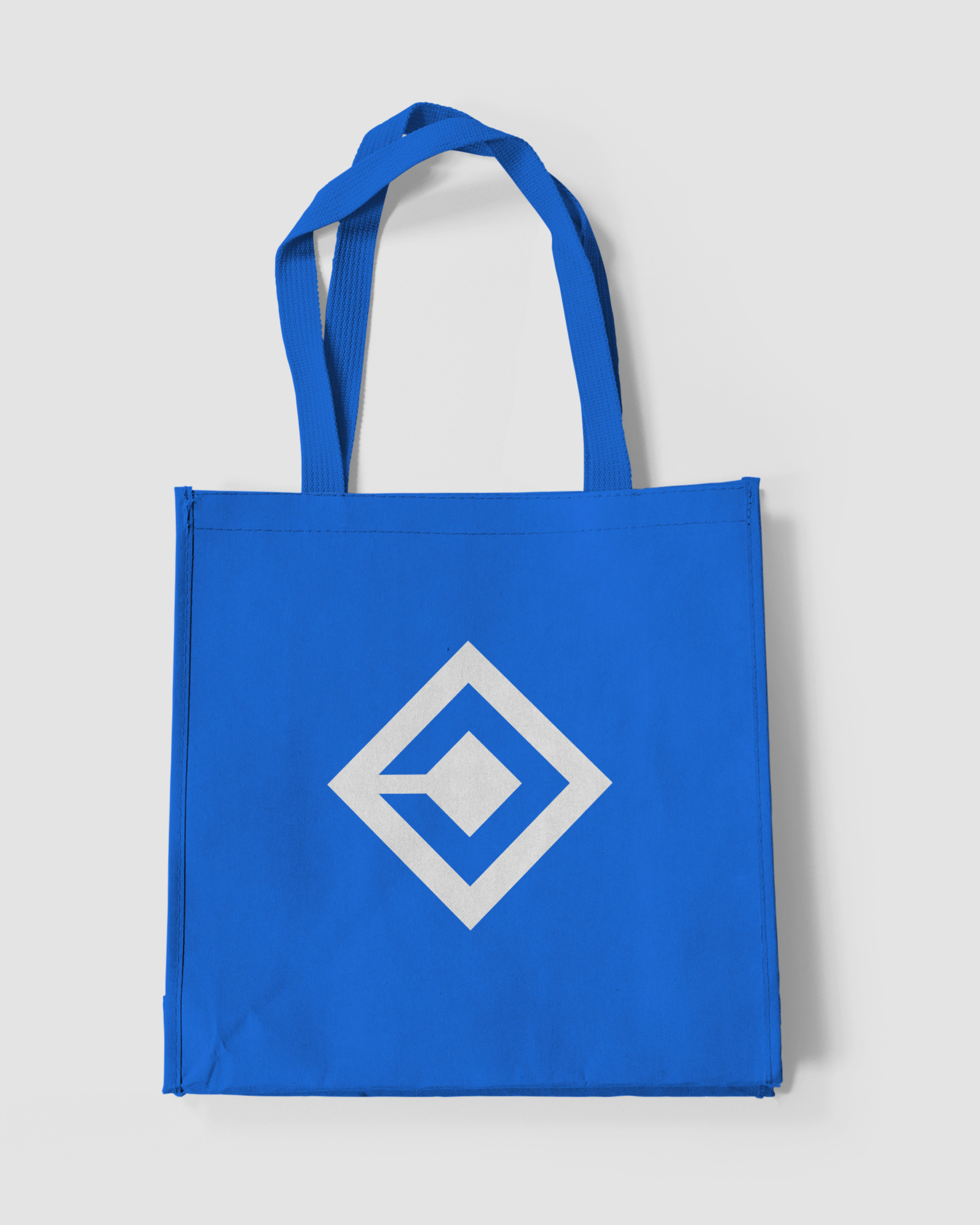
The font for the logo was chosen for its fresh yet strong characteristics. The idea of solidity and structure, the rhombus connected by a line, seen in the logo mark, was also inspired by maps used in process optimization.
Graphic identity
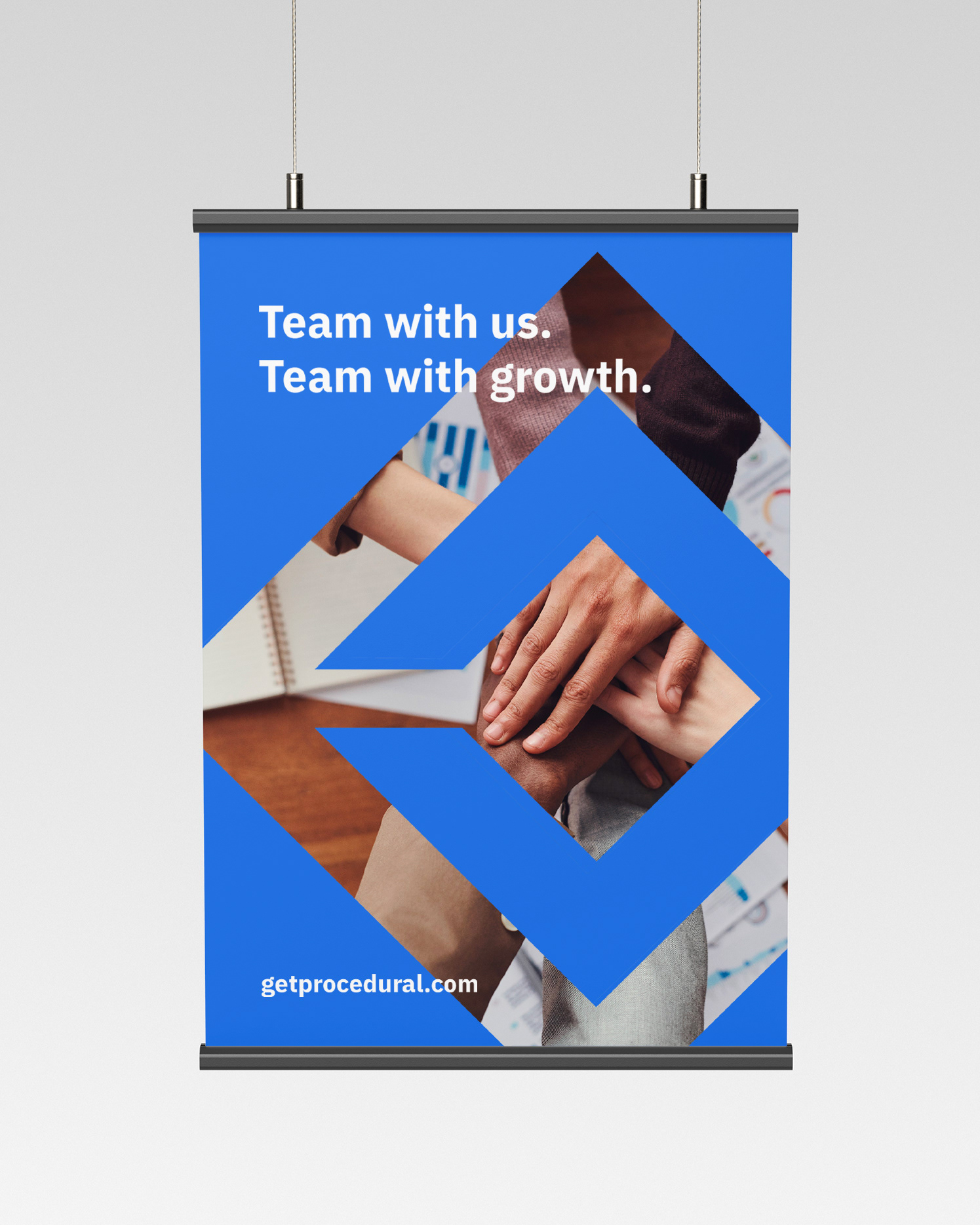
To make the color palette look fresh and solid, a bright blue was chosen for the covers and for applications with text, a more white and gray palette for more balanced designs. The brand elements are completely geometric; lines, rhombuses and squares. From it, a pattern was created with the idea of structure, a complement that aims to appear solid but not so distracting that it could seem forced.
-
Concept | Creative Direction | Logotype | Graphic Identity
Applications Design | Pattern Design | Web Design Graphic
Applications Design | Pattern Design | Web Design Graphic
Aranza Herce
⁕
Feel free to reach out to me for branding projects!
⁕
Feel free to reach out to me for branding projects!
Email aranzaherce@gmail.com
Behance behance.net/aranzaherce
Website aranzaherce.com
-
I'm also a design content creator
Tiktok @aranzahercedesign
Behance behance.net/aranzaherce
Website aranzaherce.com
-
I'm also a design content creator
Tiktok @aranzahercedesign
Instagram @aranzahercedesign
-

