Logotype Redesign / Graphic Identity Design / Applications Design
Logistics Company | TDC Logistics
Client
TDC Logistics is a container storage terminal that maneuvers, transports and performs services related to foreign trade. For the 12th birthday, the company needed a fresh and corporate graphic identity, taking into account that they needed to maintain the essence of the brand, security and trust as two of the company's important values.
Logotype and Mark
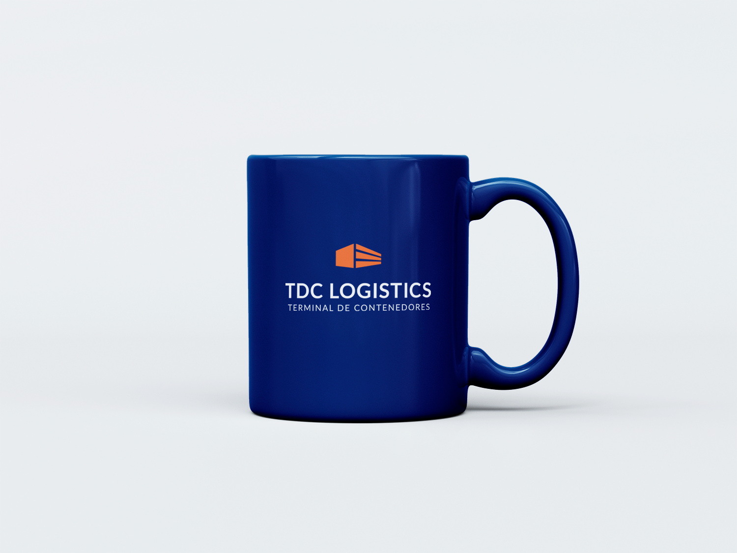
One of the first changes was the complementary name, changing the language to Spanish will ensure that all new customers know what the company is about. Because although the company works with foreign trade, the majority of clients are Spanish-speaking. The modern geometric typeface and the new vibrant blue were chosen to reflect the fresh yet professional look. The logo mark was simplified and geometrized to appear contemporary, and its color was changed to highlight the abstraction of the container.
Graphic Identity
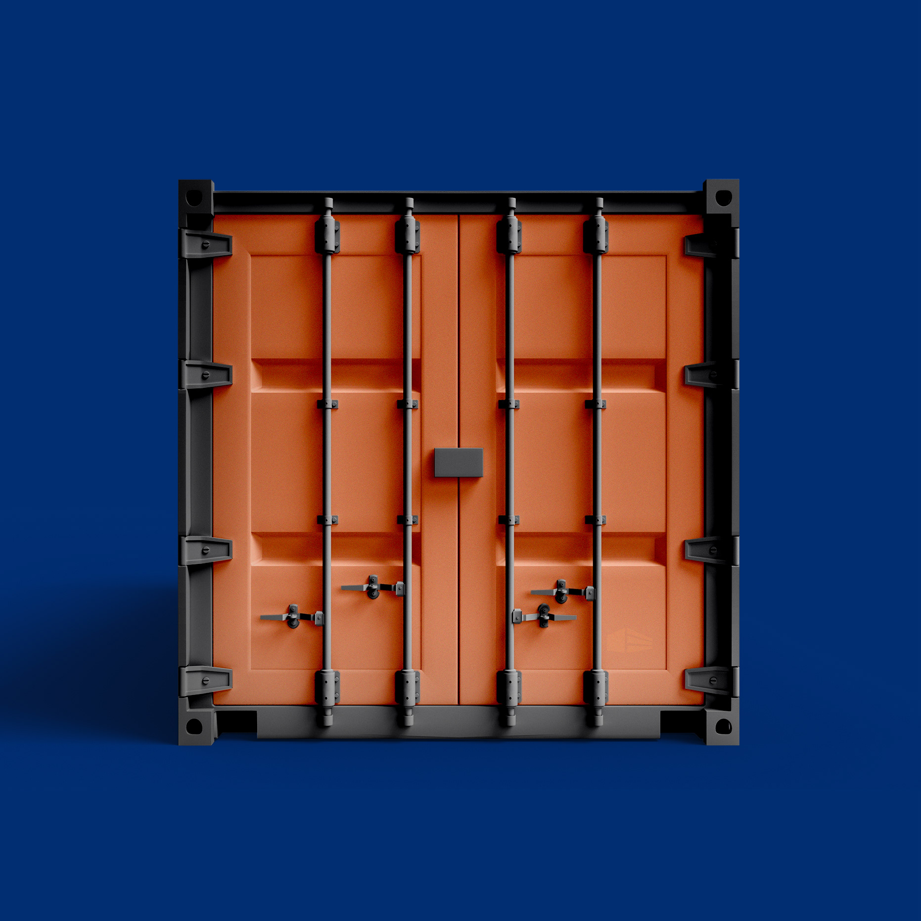
To enhance the graphic identity, the logotype mark structure was used to create a new graphic. This graphic, mainly in backgrounds, would integrate all the corporative and fresh aesthetics.

-
Logotype Redesign | Graphic Identity Design | Applications Design
Aranza Herce
⁕
Feel free to reach out to me for branding projects!
Email aranzaherce@gmail.com
Behance behance.net/aranzaherce
Website aranzaherce.com
-
I'm also a design content creator
Tiktok @aranzahercedesign
⁕
Feel free to reach out to me for branding projects!
Email aranzaherce@gmail.com
Behance behance.net/aranzaherce
Website aranzaherce.com
-
I'm also a design content creator
Tiktok @aranzahercedesign
Instagram @aranzahercedesign
-

