Concept design / Logotype / Graphic Identity / Applications Design
Home Store Branding | Ártico
Client
Ártico is a home store made in Mexico. The brand was created by a fashion designer who chose to select pieces under aesthetic and artistic criteria. The brand also stands out for its preference for the natural and organic concepts that can be seen in the interior design and in the selection of pieces.
Logotype
A minimalist logo was created to meet the effortless look, while the distribution of punctuation elements seek to create balance and authenticity. A half-open kerning was chosen to contrast the firmness of the typeface, lighten the composition, and evoke luxury.
Graphic identity
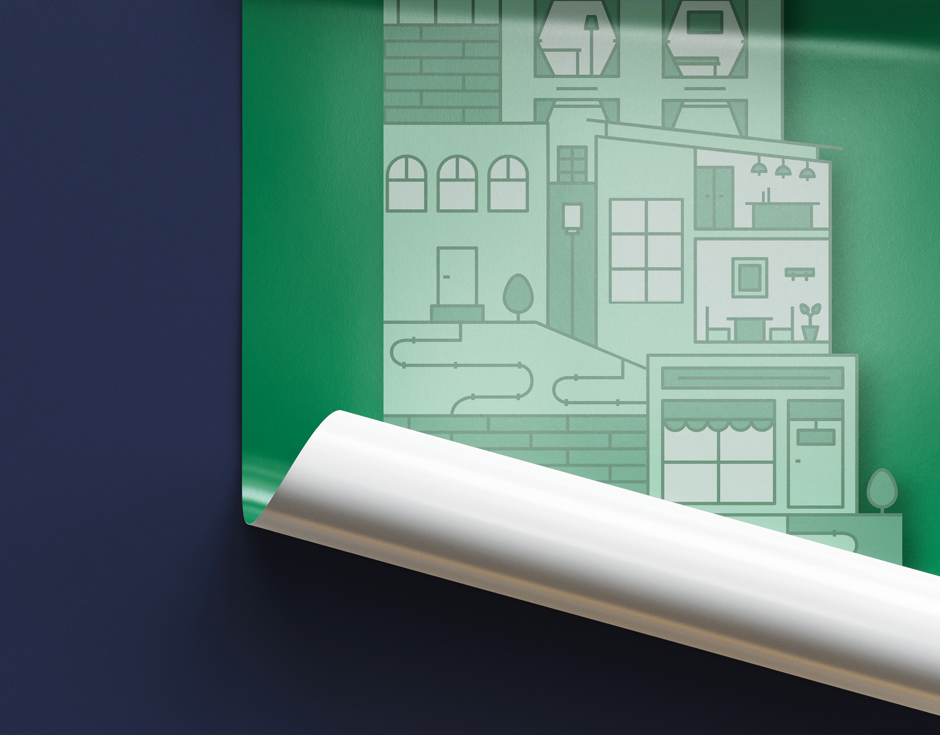
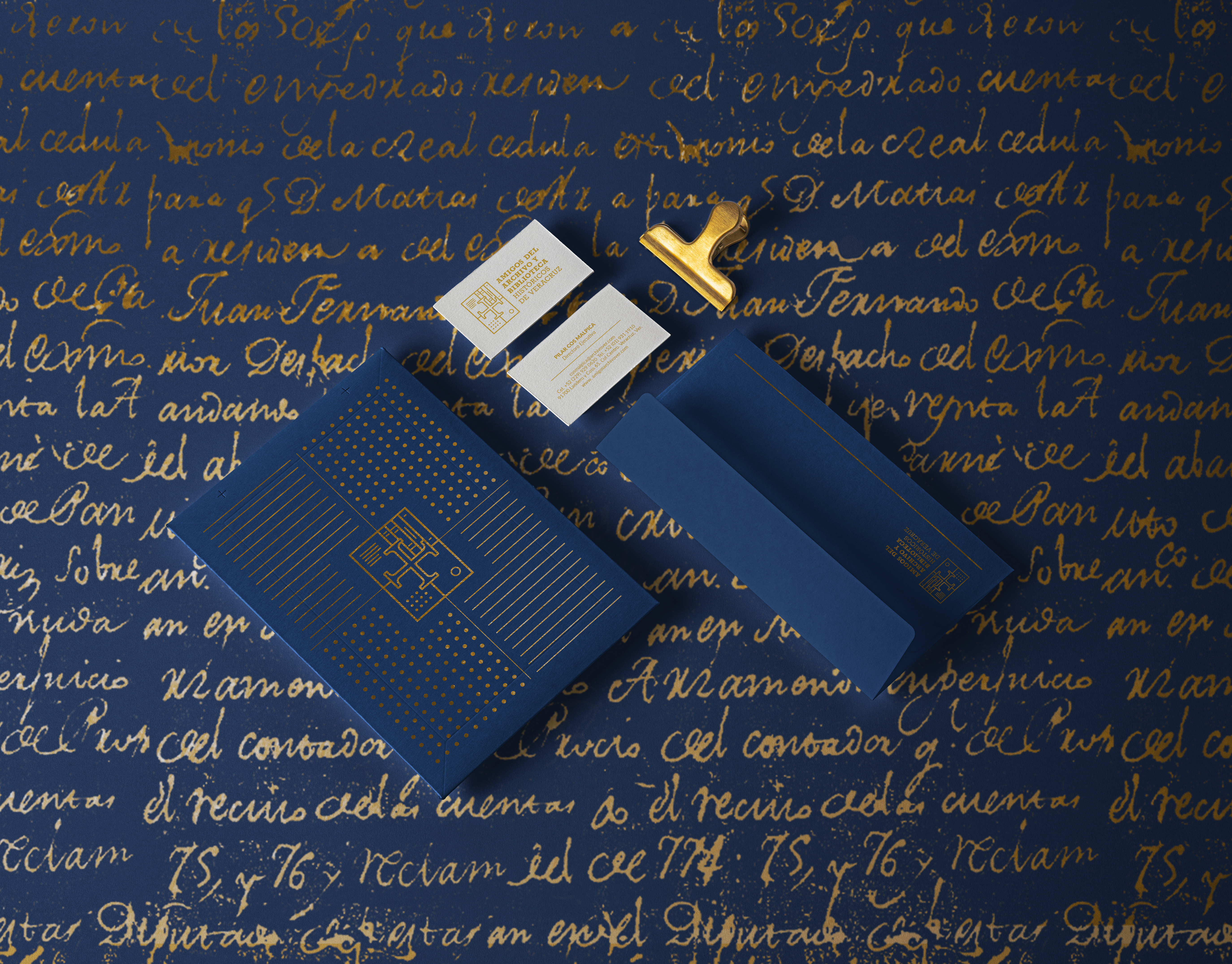
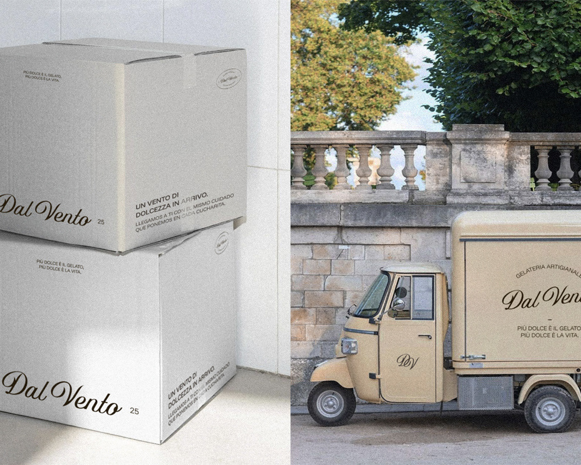
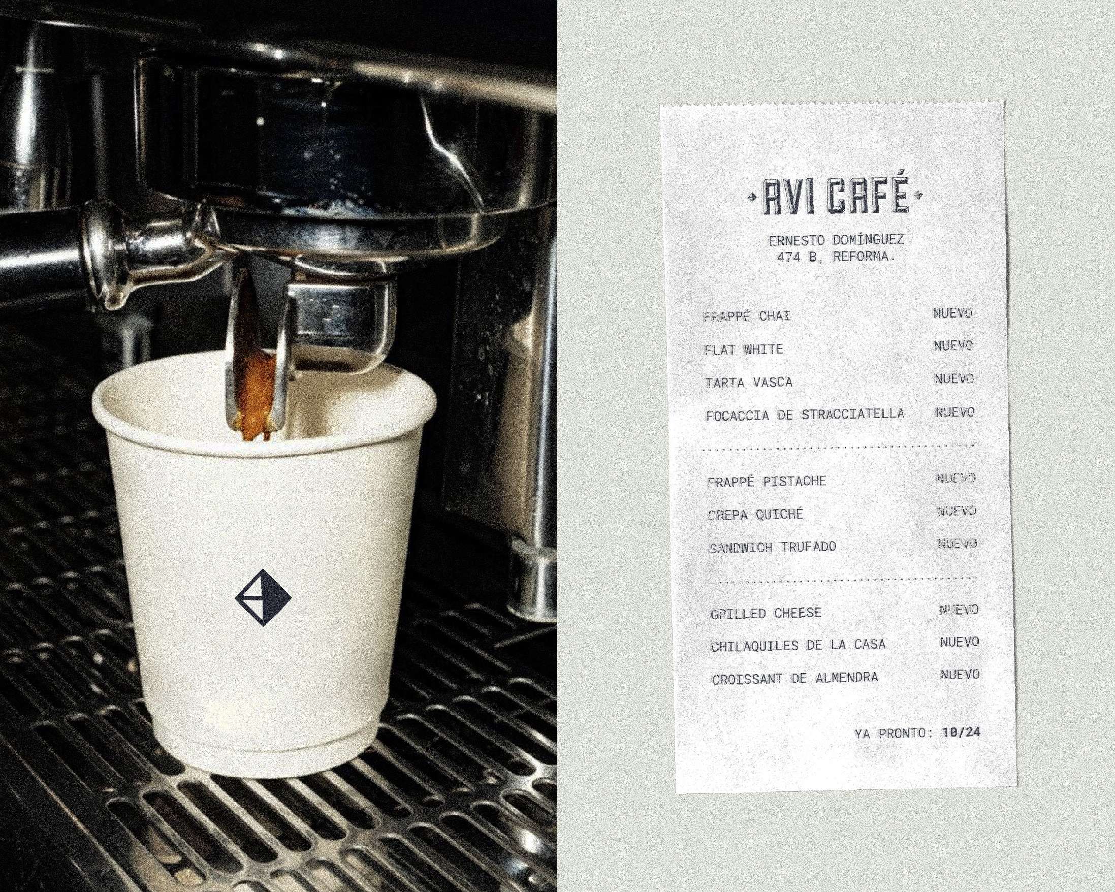
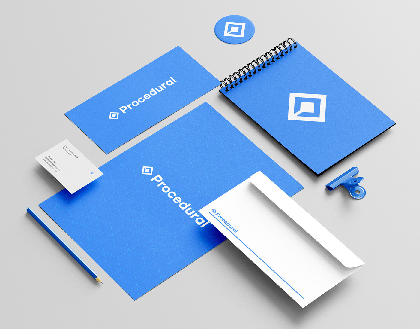
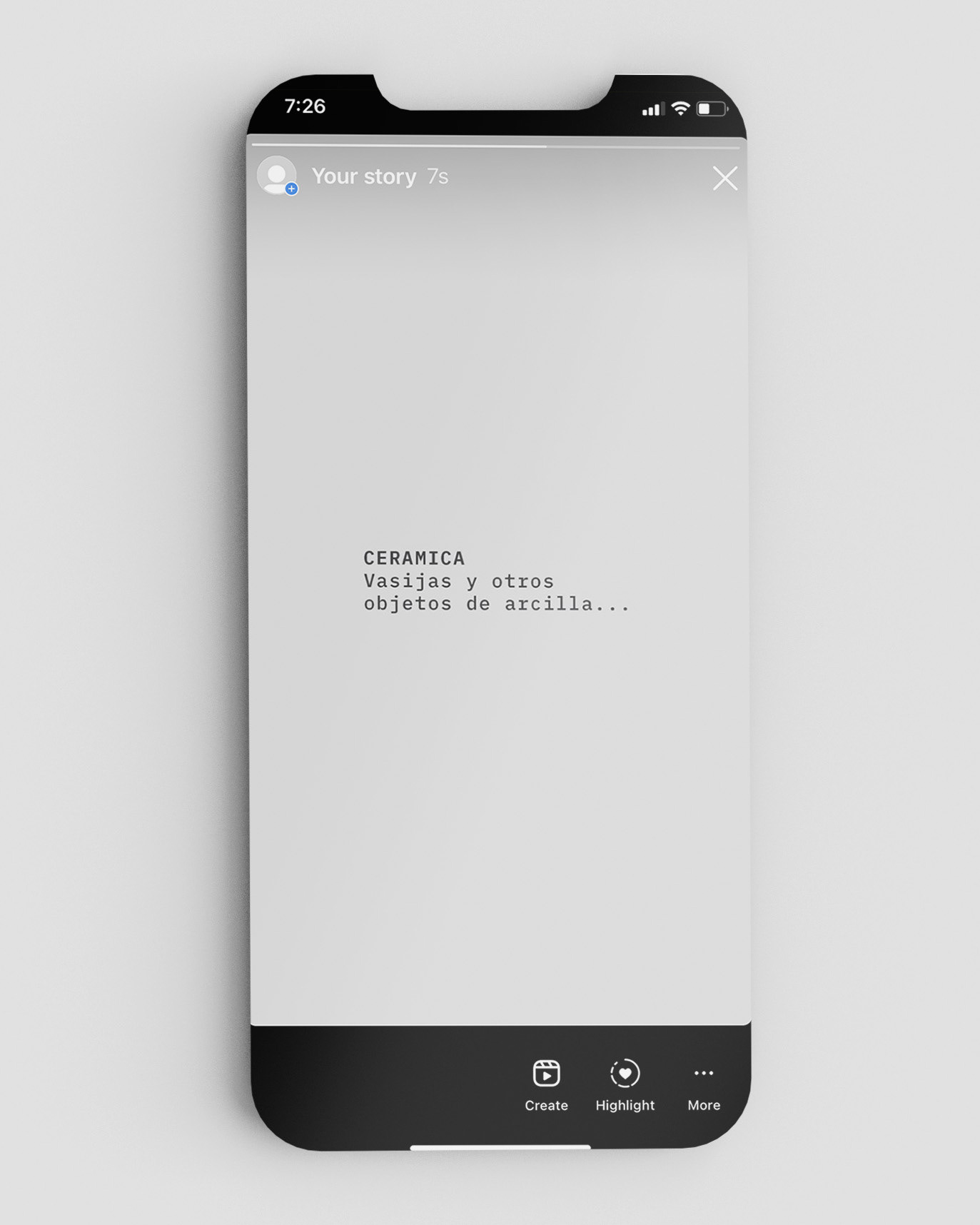
The neutral color palette is related to the concept of the name, the preference for the natural, and the interior design of the store. The IBM Mono typeface, which looks like a typewriter, aims to contrast the modern style of the logo with a vintage and artisan concept. The compositions follow a clean design by leaving blank spaces, and modern alignments by not using the typical layout. Trying to give an artistic, modern and authentic look and feel in all the applications.

-
Concept | Creative Direction | Logotype | Graphic Identity | Applications Design
Aranza Herce
⁕
Feel free to reach out to me for branding projects!
⁕
Feel free to reach out to me for branding projects!
Email aranzaherce@gmail.com
Behance behance.net/aranzaherce
Website aranzaherce.com
-
I'm also a design content creator
Tiktok @aranzahercedesign
Behance behance.net/aranzaherce
Website aranzaherce.com
-
I'm also a design content creator
Tiktok @aranzahercedesign
Instagram @aranzahercedesign
-

