Naming / Logotype / Tagline / Concept / Graphic Identity / Posters Design
Festival Branding and Posters | Vertex
Client
Vertex is a new design festival that exhibits Mexican art and design that has been influenced by historical pieces and traditions. Most of the pieces are planned to be interactive, targeting young audiences by making the learning experience more fun.
Vertex is a new design festival that exhibits Mexican art and design that has been influenced by historical pieces and traditions. Most of the pieces are planned to be interactive, targeting young audiences by making the learning experience more fun.
Naming and Tagline
In math, vertex is the point where two lines meet to form an angle. In relation to this, the name Vertex comes from the main concept of the festival, the connection between design and cultural traditions. Una conexión a través del diseño, which means A connection through design, explains the festival message and goal itself. Which is to create a bond between new design and our historical past.
In math, vertex is the point where two lines meet to form an angle. In relation to this, the name Vertex comes from the main concept of the festival, the connection between design and cultural traditions. Una conexión a través del diseño, which means A connection through design, explains the festival message and goal itself. Which is to create a bond between new design and our historical past.
Logotype
To show the concept of the festival in the logo, the vertices of the first and last letters are highlighted by a vector cut. The square and symmetrical placement of the letters was designed to have the logo scaled as a signature in the different applications.
To show the concept of the festival in the logo, the vertices of the first and last letters are highlighted by a vector cut. The square and symmetrical placement of the letters was designed to have the logo scaled as a signature in the different applications.
Graphic Identity
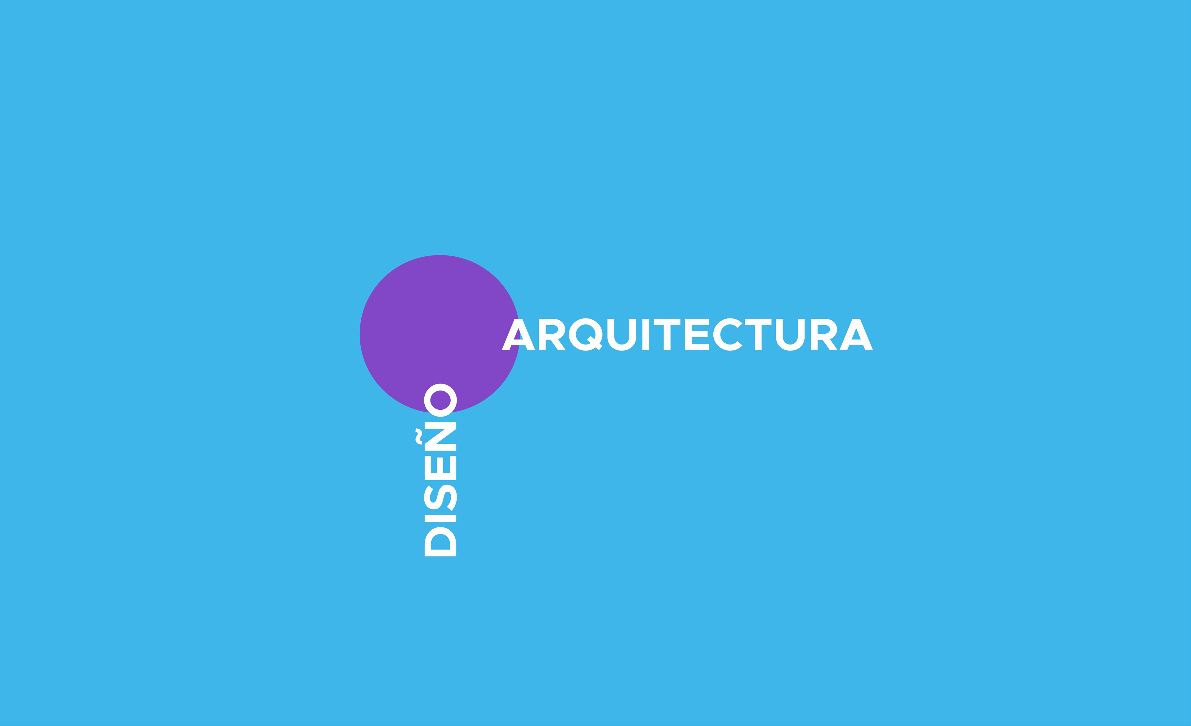
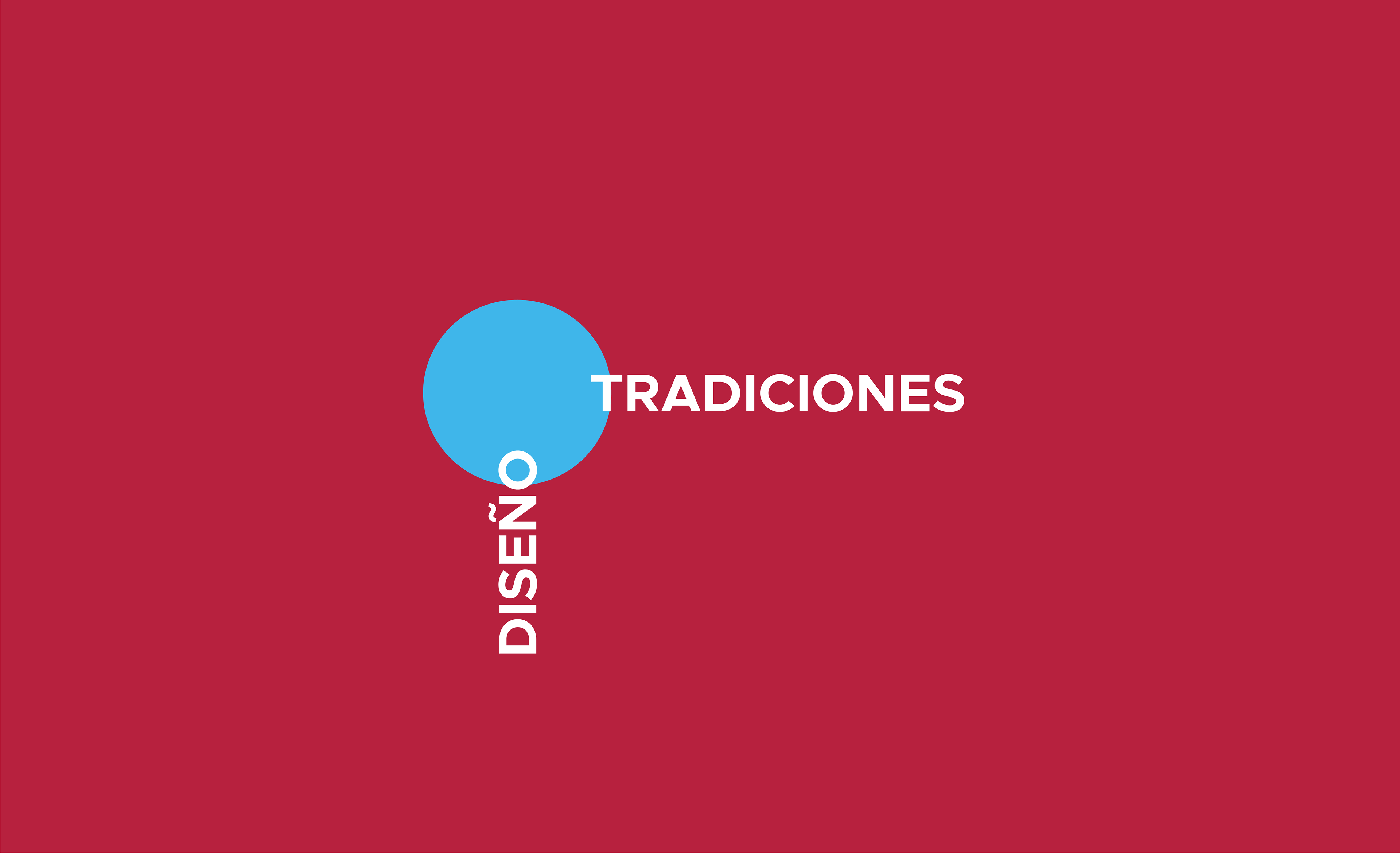
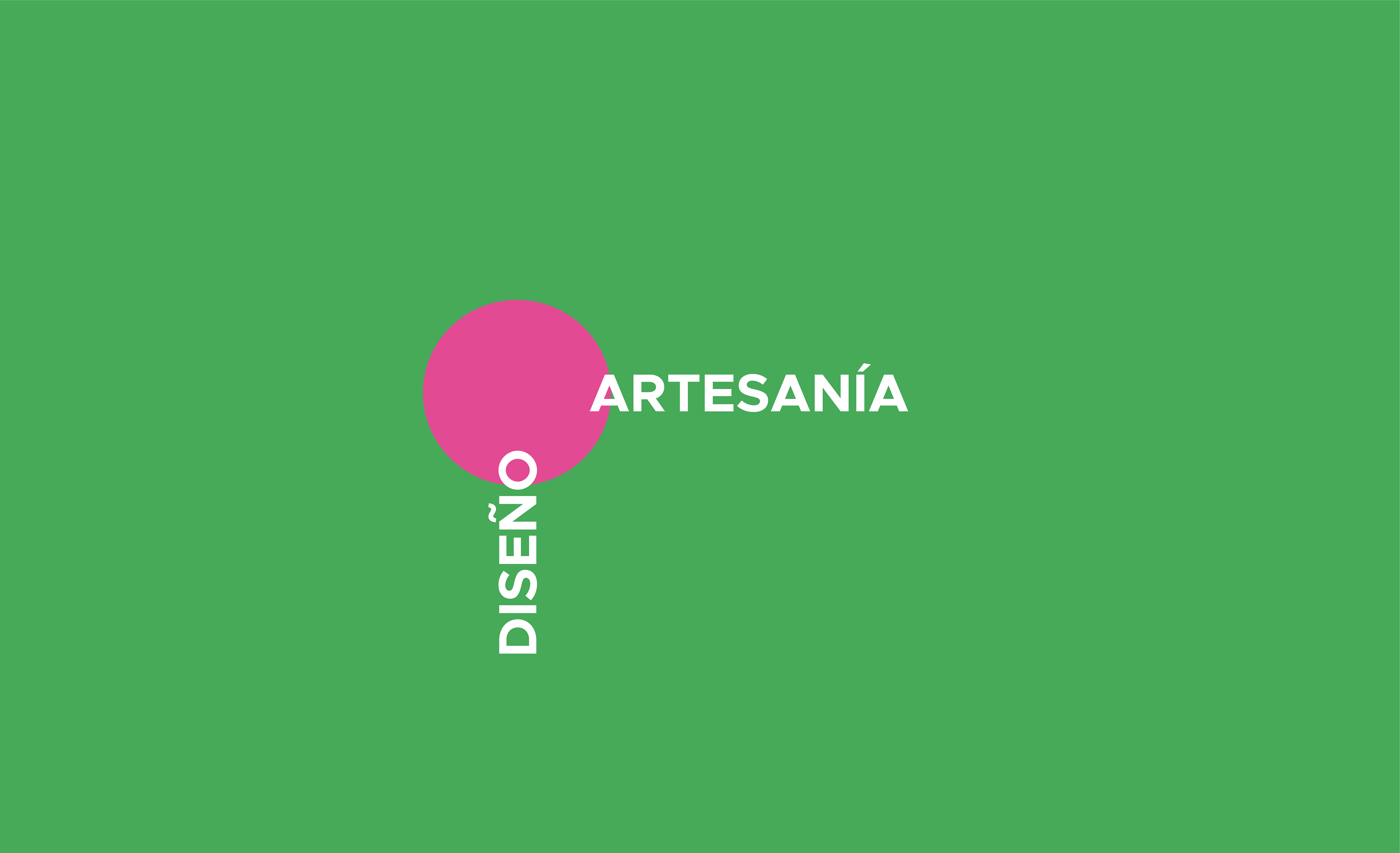
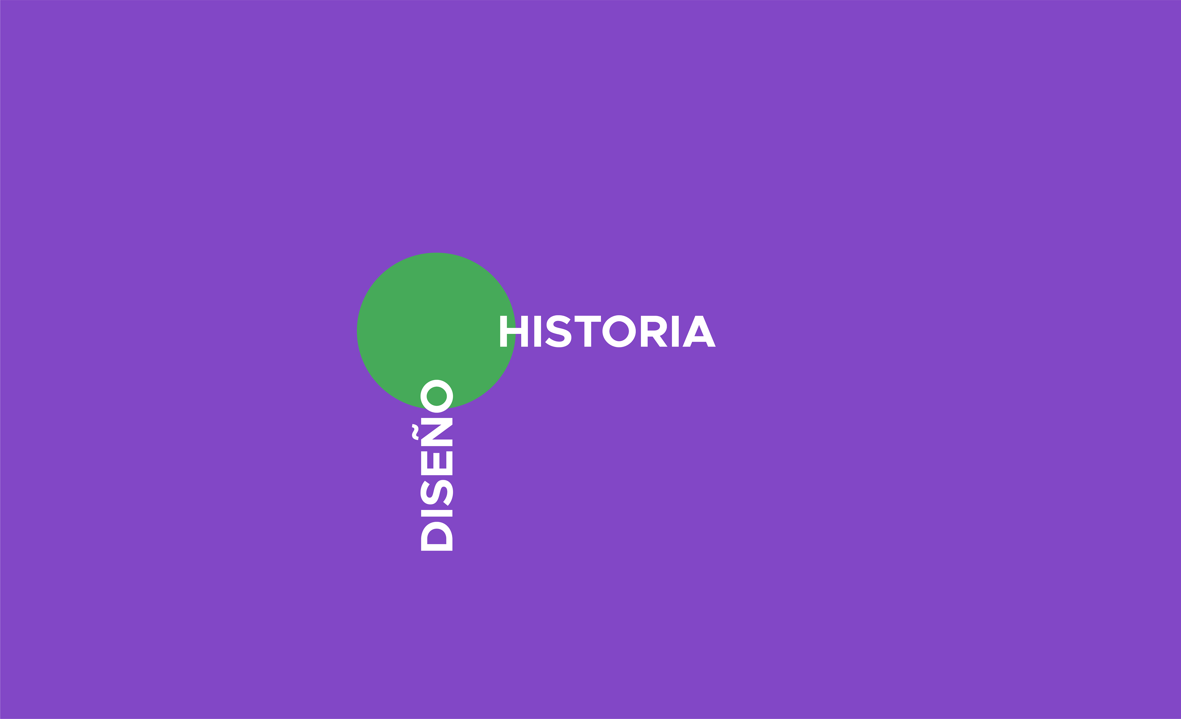
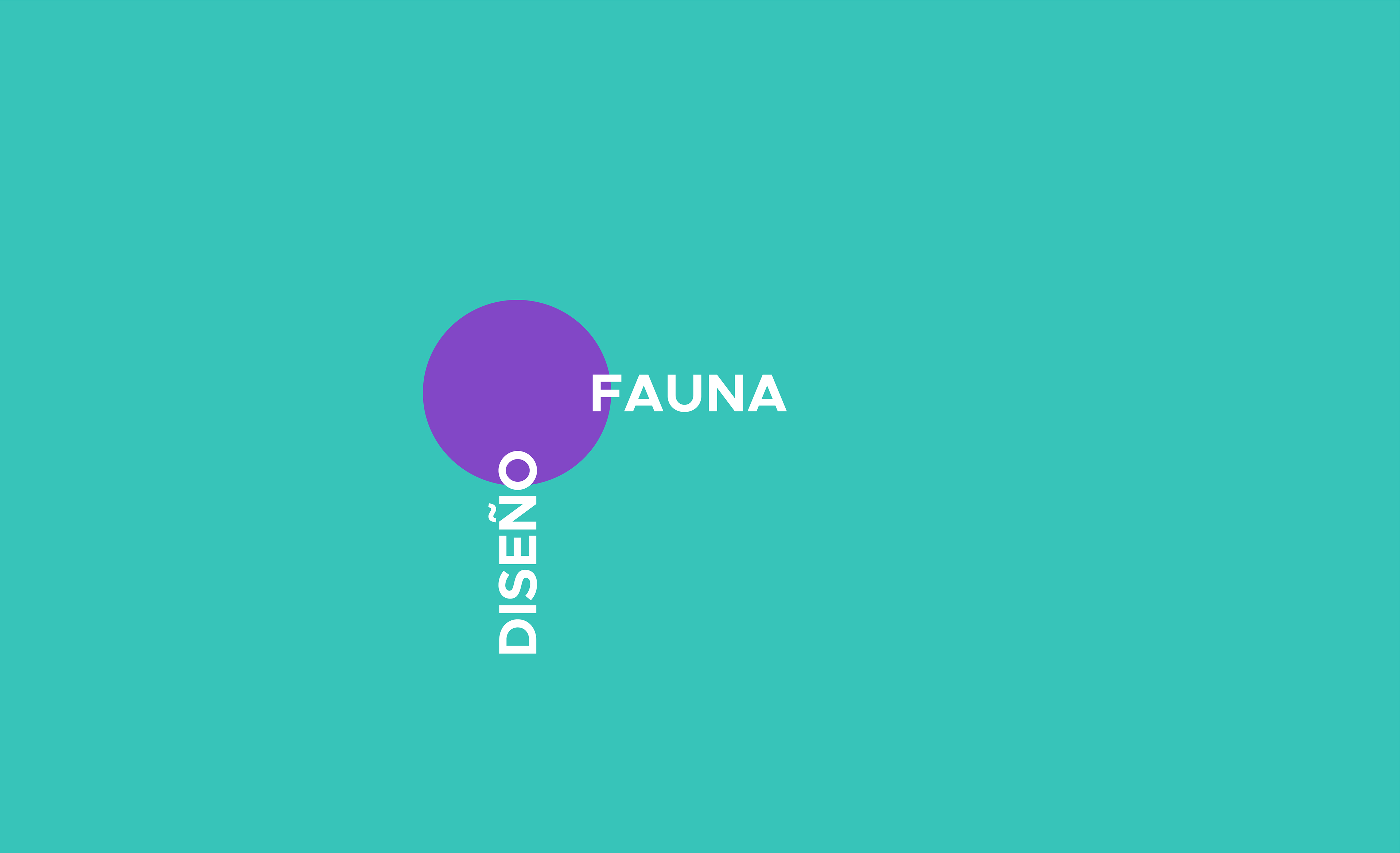
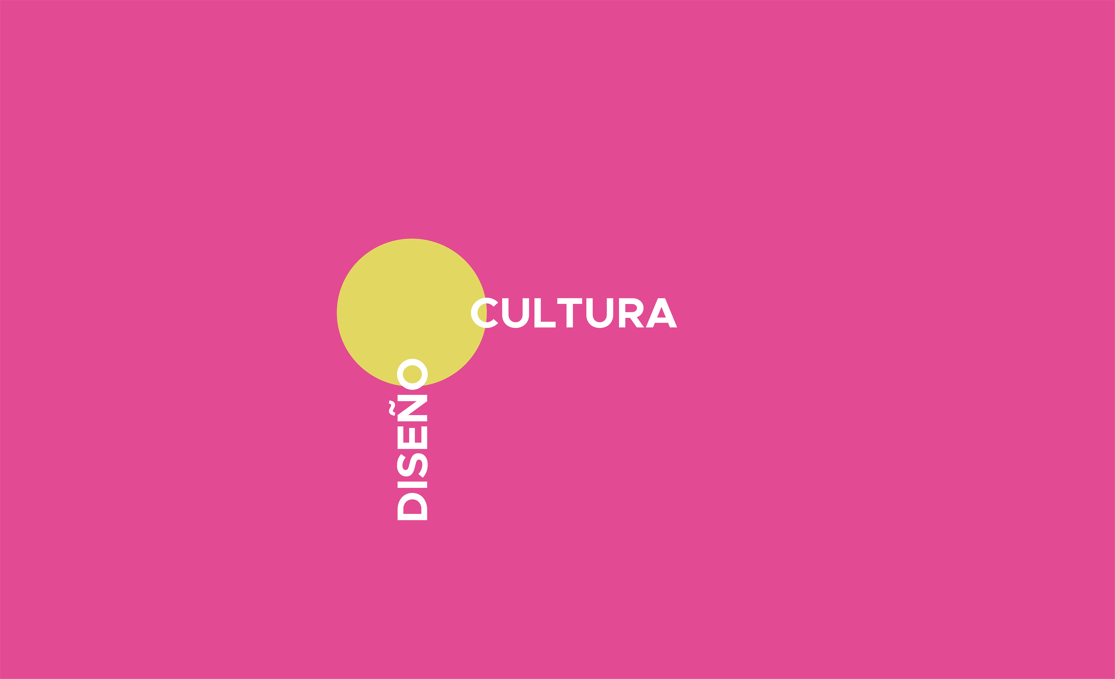
The visual identity follows the same concept of the name, tagline and brand message. The circle symbolizes the link between design and the different themes. The brand's color palette was chosen to be vibrant and powerful, but also open to change due to different topics and years of exposure. One of the most important design requirements of the brand was the need for an open graphic system. Changing the color palette for the different themes would help the brand look fresh and more interesting for new audiences.
The visual identity follows the same concept of the name, tagline and brand message. The circle symbolizes the link between design and the different themes. The brand's color palette was chosen to be vibrant and powerful, but also open to change due to different topics and years of exposure. One of the most important design requirements of the brand was the need for an open graphic system. Changing the color palette for the different themes would help the brand look fresh and more interesting for new audiences.
Poster Design
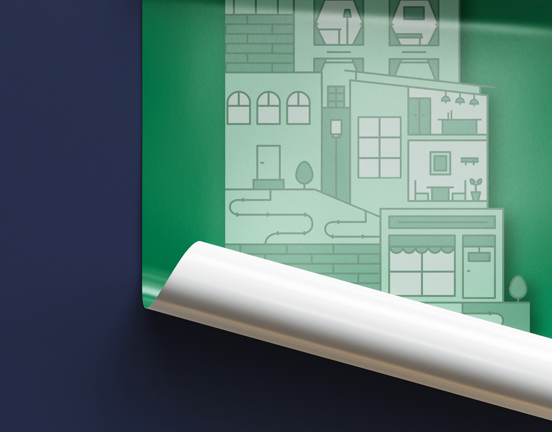
As each theme needed to be special, pictograms with geometric lines were used to intervene the images. The pictograms of the applications complete the context of the image in a fun and playful way. The layout of the poster design also follows the concept of weight and gravity that is displayed throughout the graphic system. There are no rules with the placement of pictograms, they can be in the front of the image, in the back or in the middle, which makes it more fun, open and creative.
As each theme needed to be special, pictograms with geometric lines were used to intervene the images. The pictograms of the applications complete the context of the image in a fun and playful way. The layout of the poster design also follows the concept of weight and gravity that is displayed throughout the graphic system. There are no rules with the placement of pictograms, they can be in the front of the image, in the back or in the middle, which makes it more fun, open and creative.
-
Naming | Logotype | Tagline | Concept | Graphic Identity | Posters Design
Aranza Herce
⁕
Feel free to reach out to me for branding projects!
Email aranzaherce@gmail.com
Behance behance.net/aranzaherce
Website aranzaherce.com
-
I'm also a design content creator
Tiktok @aranzahercedesign
⁕
Feel free to reach out to me for branding projects!
Email aranzaherce@gmail.com
Behance behance.net/aranzaherce
Website aranzaherce.com
-
I'm also a design content creator
Tiktok @aranzahercedesign
Instagram @aranzahercedesign
-
